The brief
A recruiter’s website serves two people with nothing in common. One wants a job this week. The other wants forty people on site next month. A single homepage that tries to talk to both talks to neither.
What we built
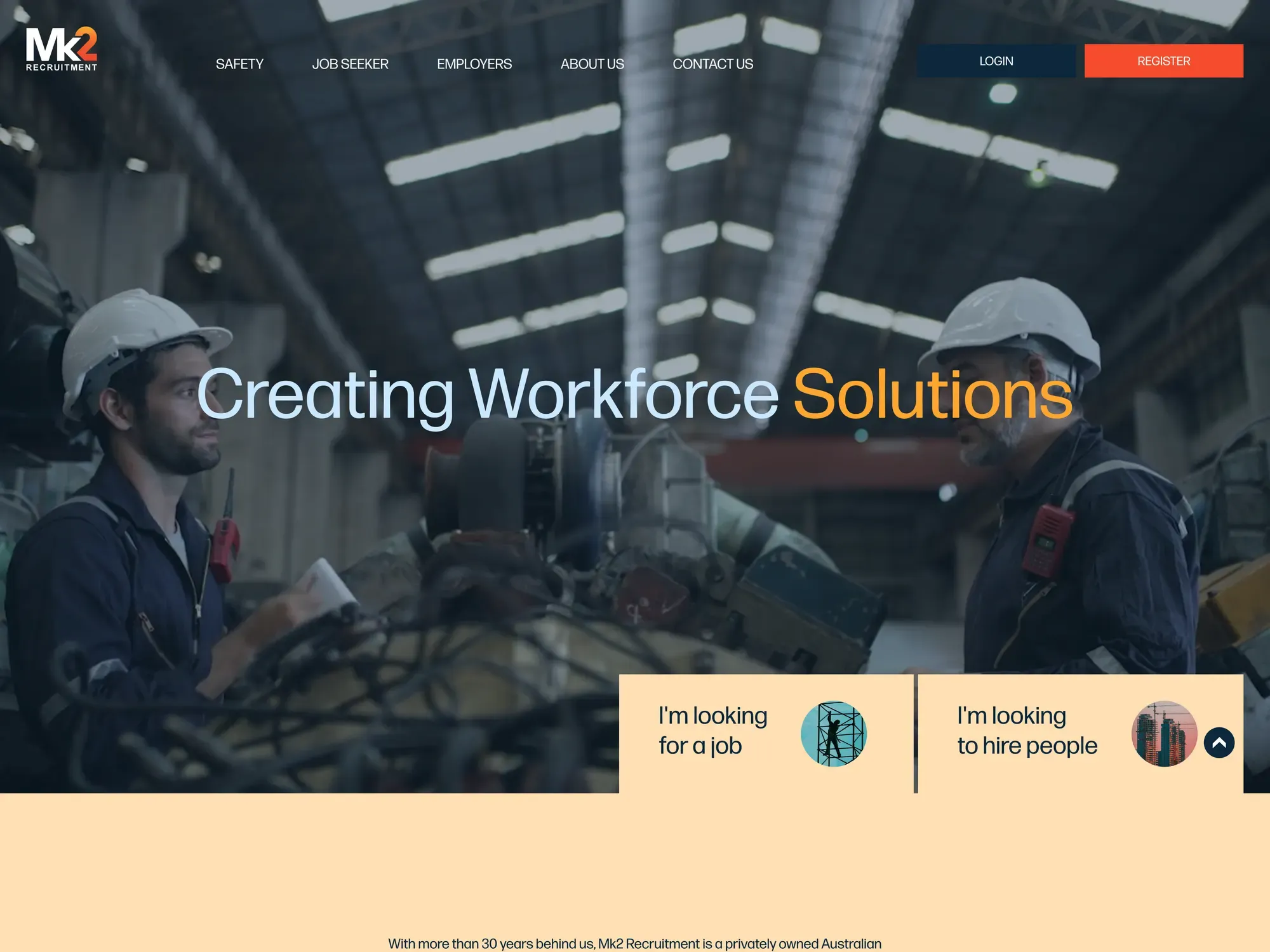
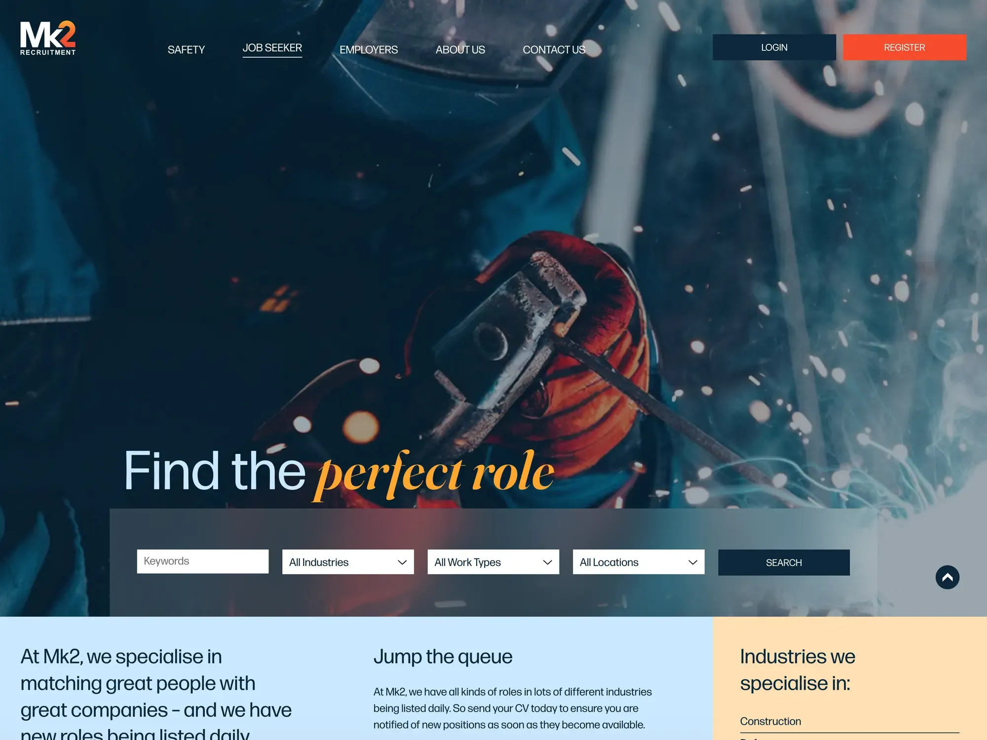
The first screen offers exactly two choices: I’m looking for a job, or I’m looking to hire people. Everything after that is a different site. Both paths carry registration and login, so a candidate and a client each end up in a system rather than in an inbox.
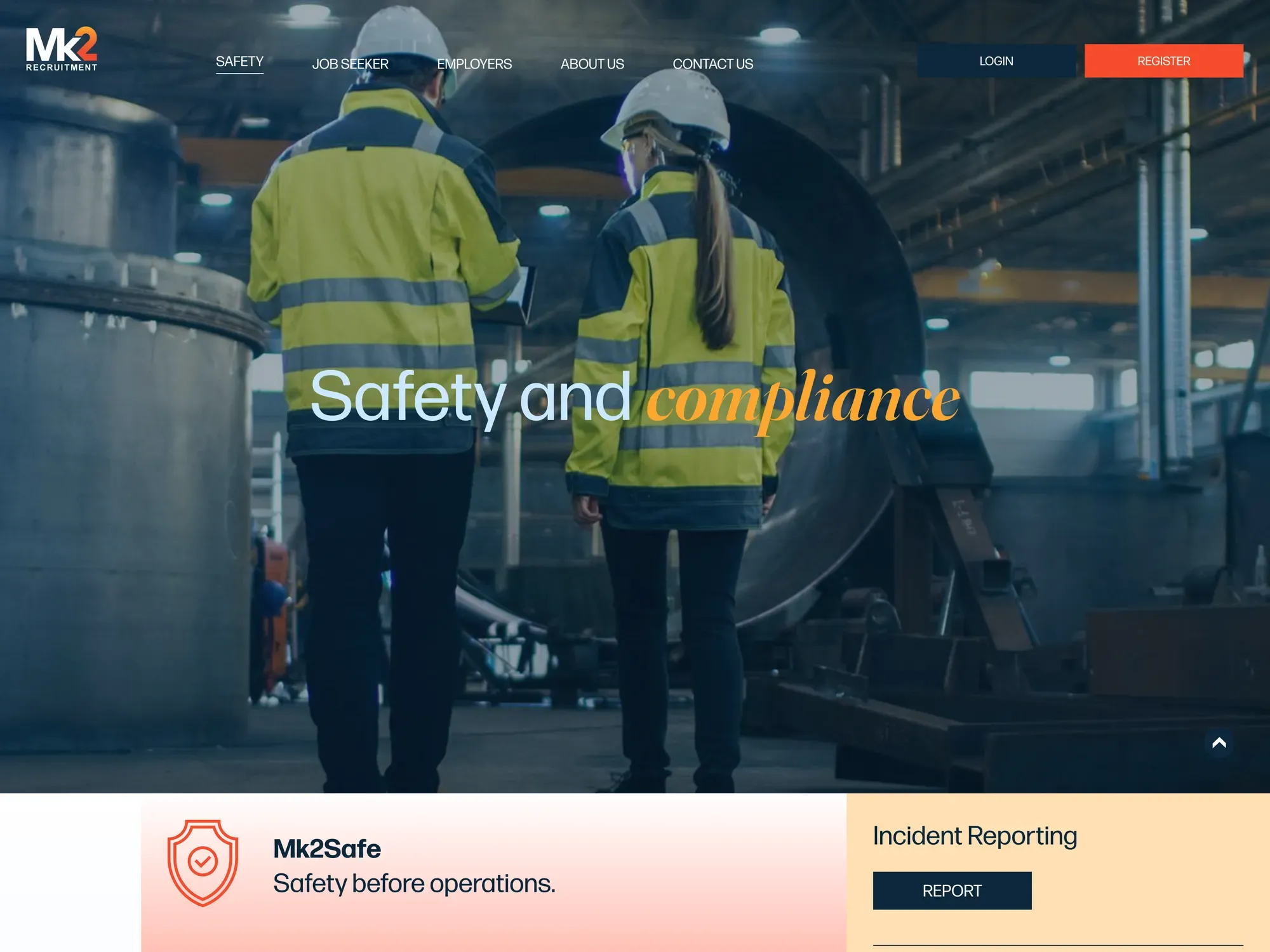
The sectors (construction, defence, mining, engineering, maritime and energy production) run across both. Safety sits in the top-level navigation with the same weight as job seekers and employers, which in this industry is a positioning statement as much as a content decision.
The engineering
Two registration flows and two logins, kept genuinely separate rather than sharing a form with a dropdown. Offices in South Australia and Western Australia each carry their own contact details and phone numbers as real links. The safety section is client-editable, because compliance content that requires a developer is compliance content that goes out of date.
Live at
mk2recruitment.com → (opens in a new tab)